July 27, 2026
5 Critical UX/UI Errors Driving Users Away From Your App (And How to Fix Them)
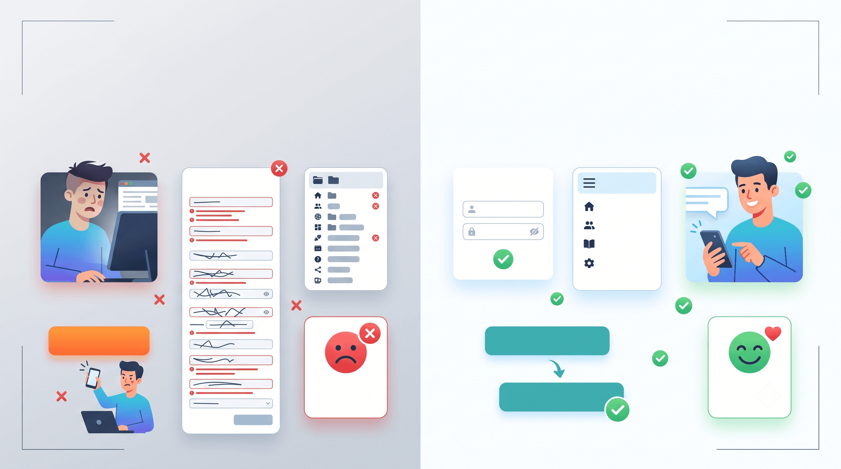
Launching a web or mobile application is only the first step. If users face navigation hurdles, cluttered interfaces, or confusing user flows, they won't hesitate to leave your platform. In this article, we break down 5 of the most common UX/UI mistakes and provide practical solutions to solve them.
1. Lengthy Forms and Unnecessary Data Requests
Nobody likes filling out endless input fields, especially on a mobile screen. Requesting non-essential information upfront (like full postal addresses or phone numbers during initial sign-up) significantly increases drop-off rates.
- The Fix: Ask only for essential data (e.g., email and password). Gather additional profile details gradually (Progressive Profiling).
- UX Tip: Enable social logins (Google, Apple, GitHub) to reduce user effort to a single click.
2. Poor Visual Hierarchy and Unclear CTAs
When a user lands on a page and cannot immediately figure out the next step, the design has failed. Primary Call-to-Action (CTA) buttons are frequently hidden, dull in color, or buried amidst competing visual elements.
If your "Buy Now" or "Get Started" button shares the same size and color as a secondary "Cancel" button, users will hesitate.
"Good UX is invisible. The moment a user has to pause and think about what to click next, the seamless experience is broken."
3. Lack of Feedback on User Actions
Have you ever clicked a submit button only for nothing to happen for 3 seconds? It's frustrating. Without visual feedback (like a loading spinner or skeleton screen) or a clear notification message, users assume the app has frozen and will repeatedly click the button or abandon the page entirely.
- Display clear visual indicators whenever a background request is processing.
- Temporarily disable action buttons to prevent duplicate submissions.
- Provide specific error messages (e.g., "Password must be at least 8 characters" instead of "An unknown error occurred").
4. Overly Complex Navigation (Cluttered Menus)
Deeply nested multi-level menus and non-standard icons place unnecessary cognitive load on your visitors. On mobile devices, improper use of "hamburger" menus can hide critical product features and key conversion paths from your users.
5. Ignoring Mobile Performance and Optimization
Even if your application looks stunning on a 27-inch desktop monitor, over 60% of web traffic originates from mobile devices. Unoptimized images, slow load times, tap targets that are too small for fingers, and broken layouts on small screens will quickly destroy user retention.
Conclusion
UX/UI optimization isn't just an aesthetic exercise; it's a direct investment in your conversion rates and customer retention. Fixing these 5 core errors will transform your digital product into an intuitive, enjoyable experience.
Is your current product underperforming on conversions? Softivo Innovations can help you conduct a comprehensive UX/UI audit and redesign critical user flows. Get in touch today for a free consultation!